This week on #WorkoutWednesday was set by Rody Zakovich and it was quite an challenge for me to work on it. This workout was more about working with dashboard actions and data modelling. Basically to evaluate how do we can use Actions to create an single sheet drill down to analyze data from year or month or day to day basis.

Requirements

  • THIS IS A SINGLE SHEET. This is not using the 3 sheets in a container technique
  • The first Level is Year, the Second Month and the Third is Day
    • You drill into whatever you click. If you click on 2015 at the Year Level, you will see all 12 months for 2015
    • Users can control->drag to select multiple years/months and Tableau will drill down with all selected.
  • When a user clicks on a Day at the Third Level, the viz resets back to all Years
  • The Sub Header will let the user know the date range in the viz.

Data for the workout can be downloaded from here

Here is my output for the challenge (Click on Image for interactive version):

Lets go through step by step process of re-creating this dashboard and also understanding how easy it can be to implement this feature into your dashboard and make dashboard interactive without adding any new sheets.

Step 1: Import the superstore data into Tableau then drag orders sheet 3 times into data area and you should be able to see something like this:

For this dashboard requirement we need 3 fields i.e. Table Name, order date and sales so we will remove all other fields and go to Sheet 1

Step 2: Before we start the visualisation, we will create all required calculated fields to ensure we have all the fields ready to use:

DrillLevel: Add identifier for Orders union

Year_Month_date: Calculated field to show data Year and monthly format and will be used for BAR chart for Year and Monthly data

Day_date: Calculated field to show day and will be used for LINE chart to show daily data for the month

BarSize: Size of BAR in the sheet

Drill down filters for current and previous level filters:

CurrentLevelFilter:

PreviousLevelFilter:

Step 3: We are ready to start with visualisation now, lets drag Year_month_date and Day_date into rows and sales into columns

Change both date fields into exact date:

For Year_Month_date, select the chart type as Bar chart and line chart for day_date field then convert day_date into dual axis with sync axis. Remove the color tags from both the axis to main blue shade for charts

Drag PreviousLevelFilter into details section under marks area:

Drag Bar Size into Size area for bar chart (Year_Month_date) and have measure value as minimum:

Step 4: Create a Dashboard and drag sheet 1 into Dashboard

Then go to Dashboard –> Action –> add Filter –> set the filter source field as PreviousLevelfilter and Target field as CurrentLevelFilter as shown below:

That’s it our Drilldown report with single sheet is ready. We will need to format and clean the report to make it look like above final report.

You can download the Tableau file from here

Happy Data Visualisation!!!!

Thanks for visiting this post. Please do let me know your feedback and if any particular topic you would like me to write on.

Do subscribe to Tabvizexplorer.com to keep receive regular updates.

For #MakeoverMonday week 26, it was huge dataset about London’s Cycle hire usage (Boris Bikes) :

Here is the original viz was created by Sophie Sparkles:

Screen Shot 2018-06-21 at 12.19.45 pm.png

To access the entire data from 2012 to 2018, one can use Exasol data source shared here or one can download the dataset for 2017 from data.world

Here is what I did:

  • I wanted to see correlation between weekday and hourly data hence use heat map with bar charts to see the data.
  • Added highest and lowest hour highlight
  • Use filter of year to filter for the year and use the map to see all the pick up points in London
  • added interactivity on graphs and maps to provide option to filter on any pick up point and analyze the data

Here is the Gif of the visualisation I created (download on the gif to download the Tableau file):

Use following steps to connect to database post of file:

  • Navigate to the sign-up page to register
  • You will receive an email with your credentials
  • Download the EXASOL driver (Tableau 32 bitTableau 64 bitTableau Mac OS)
  • A connection prompt will appear once you start dragging fields onto your worksheet. Enter your credentials (from the above email) in the connection prompt
  • start your analysis

Thanks for visiting blog. Please do let me know your feedback and if any particular topic you would like me to write on.

Do subscribe to Tabvizexplorer.com to keep receive regular updates.

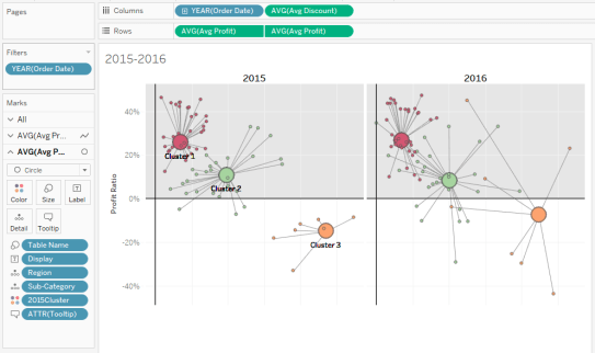
This week on #WorkoutWednesday challenge was set by Luke Stanke and it was about using analytical capability of Tableau specifically clustering. We can perform customer segmentation using clustering algorithm of Tableau but here we will implement clustering algorithm using sub-category and region. In this post, we will go through step by step process of creating clustering and then build Hub & Spoke plots.

Requirements for Workout Wednesday:

  • Dashboard size is 700 x 800; tiled; 2 sheets
  • Create clusters using Profit Ratio (Total Profit/Total Sales) and average discount from only 2015 for sub-category and region. This is the basics of segmentation
  • Show the consistency of each cluster by plotting this over year, as well.
  • Match tooltips.
  • Label the clusters in 2015. Only show the label once. Don’t place many marks of text on top of each other.
  • Match color and formatting. I’ll be paying attention to all parts.
  • JEDI ONLY: Create hub-and-spoke plots that connect the center of each cluster to the value sub-category/region combinations that are part of the 2015 cluster.

Data for the workout can be downloaded from here

Here is my output for the challenge (Click on Image for interactive version):

Step 1: Import the superstore data into Tableau then drag orders sheet multiple times into data area and you should be able to see something like this:

Once data is imported then go to sheet 1

Step 2: As per requirement, we will create clusters using 2015 data on the basis of profit ratio and avg discount. First we will create profit ratio calculated field:

Drag order date from dimensions and filter for the year 2015:

Drag discount field into columns and convert into average then drag profit ratio field into rows. Post this, drag region and sub-category field into details under mark area as shown in below image:

Step 3: From the analytics tab, drag clustering into visualisation area as shown below:

Enter number of clusters as 3

Drag cluster created into data area to create the group and freeze the clusters based on 2015 data and rename the field as 2015Cluster:

you can click on edit the group field and see that 3 groups are created on the basis of 3 clusters:

Step 4: Next step is to create calculated fields to show average profit and average discount on the basis of sub-category, region and cluster:

Step 5: Add new sheet, drag order date to filters and apply filters for year 2015 and 2016. Drag order date (select year) and avg discount field (convert the measure into average) to columns section

Drag avg profit field twice into rows section (convert the measure into average)

Step 6: Change the chart type for first Avg Profit field to line chart then add Region and  sub-category fields into details along with Table Name field into path as shown in below image

Step 7: Change the chart type for second Avg Profit field to circle chart then add Region and sub-category fields into details and drag Table Name field into size as shown in below image then drag 2015cluster field into colors as shown in below image:

Change the graph into dual axis then the data visualisation layer looks like below:

Perform bit of formatting and adding a reference line will make it look like this:

Duplicate the sheet and change filters to 2017 and 2018 then add both the sheet into dashboard. As per requirement change the dashboard size to 700 * 800 and your dashboard is ready with visualisation.

Tableau file can be downloaded from here.

Happy Data Visualisation!!!!

Thanks for visiting this post. Please do let me know your feedback and if any particular topic you would like me to write on.

Do subscribe to Tabvizexplorer.com to keep receive regular updates.

Tableau Prep is new tool from Tableau which helps to help people transform, clean and massage their data for analysis quickly. With simple drag and drop features to simplify the complicated tasks of joins, unions, pivots, aggregate or create calculate fields the data quickly.

Let’s quickly see how Tableau prep works and for that one needs to download Tableau prep and install it from here. For this exercise, we are going to use superstore data which can be download from here.

Objective of this exercise is to get output something like this:

Final prep file will look like this:


Open Tableau Prep after installing and you can see below screen:

Step 1: Connect to Data source:

Tableau Prep provides flexibility to connect more than 25 data sources right from csv to Amazon redshift to greenplum database.

Click on Connections –> Select Microsoft Excel –> select the file downloaded earlier from path

Once data file is loaded into Prep, you will get data like below. Here, on left hand side we see various sheets in the excel file (source) and on right side we get to see plain white area where we can drag one or multiple source files or tables. Next is we will drag orders into white area and we will see bottom half of right side list of columns in the file.

Here we can select the columns required for further processing or deselect the unwanted fields. For the purpose of this post, I selected Customer id, order date, product id, category, sales field from the input section:

Step 2:  Finding the customer level first purchase date with its sales, number of distinct product ids and categories

Tableau prep gives various options to perform next step in data preparation:


Select aggregate option, then drag customer id into group fields and order date into Aggregated fields. Change the aggregation level to minimum for order date (shown in below image)

Add another aggregate from the source orders, then drag customer id, order date into group fields while drag sales, product id and category into aggregation levels. Ensure Aggregation level for sales is sum and for product id & category should be distinct counts. It will look something like below screenshot.

We can directly set the type aggregation on field by clicking on field and selecting the type as shown in above image.

Now, its time to use Join operation to join both the aggregate results to get first purchase date, sales, count of products and categories:

Add Join from aggregate 2 then drag Aggregate 1 into join as shown in image:

Then add the join condition on customer id and order date as shown below:

Finally, we have all required fields but we also got duplicate fields for customer id and order date. We will remove this field using cleaning step:

Along with this we will rearrange the data and rename fields for better clarification (order date -> 1st purchase date, sales -> 1st purchase sales, Product id -> 1st purchase products and category -> 1st purchase categories)

We can anytime look at the changes made on the left side under changes section.

With this we have customer ids with their first purchase date, sales, number of distinct products and distinct categories

Step 3: Customer ids with second purchase date, sales, number of distinct products and distinct categories:

Add New join operation on Aggregate 1 and Aggregate 2 with slightly different join criteria where matching customer id but order dates are not equal. (highlighted in Yellow in below image)

Add step to remove duplicate order date-1 and customer id-1 field:

Add Aggregate (Aggregate 3) to find the minimum order date from this data (as we had removed first order date when we applied second join (Join 2))

Add Join (Join 3) from aggregate 3 and apply join with Aggregate 2 on customer id and order date as shown in below images:

Now we have got desired output along with duplicate fields of customer id-1 and order date-1. We will remove this fields using add step operation for cleaning of our dataset.

Along with this we will rearrange the data and rename fields for better clarification (order date -> 2nd purchase date, sales -> 2nd purchase sales, Product id -> 2nd purchase products and category -> 2nd purchase categories)

Now we have both the dataset ready with required information.

Step 4: Combine the dataset (output from clean 1 & clean 3) using join on Customer id

Here we have duplicate field of customer id which we will remove using step operation and rearrange the data to see proper arrangement:

Final step is to export the data into either .hyper or CSV or .tde file using output operation as shown below:


Click on Run now and generate the file. Now, this file can be directly imported into Tableau for data visualisation:

Overall, I really liked the easy nature of Tableau Prep which allows non-technical users to create their own data flow or kind-off ETL to generate the output dataset with necessary transformations.

The final version of Tableau prep file is available Here:

From the output file generated from above process, I had designed the following Tableau data visualisation:


Happy Visualisation!!!

Thanks for visiting blog. Please do let me know your feedback and if any particular topic you would like me to write on.

Do subscribe to Tabvizexplorer.com to keep receive regular updates.


For #MakeoverMonday week 25, Dataset was about influenza cases in the US which was visualized in line chart:

Here is the original viz by CDC:

Data is available on data.world week 25:

Here is what I did:

  • Filtered the data to use from season 2006-07 to 2017-18 (Season 2009-10 had few duplicate weeks in data shared)
  • Used highlight table to show number of patients for each week in season
  • Added tooltip to show number of patients compared to total patients reported

Click on the viz to use the interactive version.

Thanks for visiting blog. Please do let me know your feedback and if any particular topic you would like me to write on.

Do subscribe to Tabvizexplorer.com to keep receive regular updates.