This week #workoutwednesday challenge was set up by Rody Zakovich, it was about creating a connected scatter plot on hover which allows user experience (UX) feature not available in natively available in product.

Requirements

  • Dashboard size is 600 x 600
  • The Scatter Plot has Sales by Profit for each Category and Year
  • When a user hovers over any category, all years for the category will be connected by a line
  • The line connects the categories by year in ascending order

Data for the workout can be downloaded from here

Here is my output for the challenge (Click on Image for interactive version):

The Challenge seems to be simple but the actual challenge is to create the effect without affecting other categories i.e. they should still be visible and not disappear

Let me share the steps I performed to achieve this effect which I think is cool way to showcase scatter plot for user experience:

Step 1: Data Preparation

Since dataset has 3 categories, we will union the orders sheet twice with original data with required fields of Order_date, Category, sales and profit.

This union of dataset will help us to create the action filter in further steps.

Step 2: Calculated Fields

CalcProfit: we will use LOD function to create average of profit values on the basis of Category, Table Name, year of Order date) since we have duplicated the numbers average will help us get original values

CalcSales: we will use LOD function to create average of sales values on the basis of Category, Table Name, year of Order date) since we have duplicated the numbers average will help us get original values

SalesCategorywisesales: This field is to aggregate the data on each category using the Table name field

SalesCount: This field is conditional field to show the line chart in our next chart

CalcCategory: Final field of mapping each category to table name for Action Filter

Step 3: Create the visualisation

Replicate the below Visualisation with relevant fields into rows and column shelf then create the dual axis. Post this add required field into Marks shelf for both CalcSales and SalesCount field.


Step 4: Add Action Filter

Last but the most important step, create an dashboard and import the sheet into dashboard. Then select the Dashboard –> Action Filter

set the action on hover on the basis of CalcCategory to Table Name

Do few changes in format and tooltip

Now we are ready with visualization with user experience which we wanted to show.

Click here for Tableau file

Thanks Rody Zakovich for this workout.

Happy Data Visualisation!!!!

Thanks for visiting this post. Please do let me know your feedback or if you have any questions about the blog do not hesitate to contact me on twitter (@Desaimithun)

Do subscribe to Tabvizexplorer.com to keep receive regular updates.

This week #workoutwednesday challenge was set up by Luke Stanke, it was about scaling the data into same level using log axis. Whenever we want to analyse the spread of data we end up having skewed bars with one or two group are at higher levels while others are with tiny bars which makes it difficult to understand their behavior. Here, we will be scaling the axes with log to analyze the per-order profit across sub-categories.

Requirements

  • Dashboard size is 500 x 700; tiled; 4 sheets
  • Use the superstore dataset. Focus on the Sub-category of the “Technology” category.
  • Show profit per order on the columns (x-axis).
  • Use a parameter to round the profit to the nearest $25, $50, $100, $250, $500, or $1000.
  • Show distinct count of orders on the rows (y-axis). Set your axis to run from 0 to 999.
  • Set the axis to be log.
  • Make sure to assign the highlight color to each sub-category.
  • Filter to orders with profits from -1500 through 1500.
  • Create bars and center them on the appropriate value. Set the width of the bar to the rounded value.
  • Add annotations so they only show when $100 is selected on the parameter.
  • Set the height of the Accessories, Copiers, and Office Supplies to 110 pixels. Set Phones to 160 pixels.
  • Match color, tooltips, and formatting. I’ll be paying attention to all parts.

Data for the workout can be downloaded from here

Here is my output for the challenge (Click on Image for interactive version):

Requirement were very clear and also given few hints (I had to go through them) to derive the end results. Here the steps by step process of creating this Visualisation.

Step 1: Create the parameter with values list from $25 to $1000 (total 6) and create the calculated field with parameter as shown in below image:

Step 2: Create calculated field called RoundProfit as we need to round the profit values based on parameter value:

Duplicate the sub-categories field 3 times and rename them to sub-categories_1, sub-categories_2 and sub-categories_3

Step 3: As per requirement lets add filter for ‘Technology’ as category and drag RoundProfit as put the range between -1500 to 1500

Step 4: Drag Roundprofit field to column area and set type as ‘Dimension’ from the drop down option, Order id field into rows and set measures as distinct count, add dummy field in rows as ‘Accessories’

Based on above requirement, lets convert the y-axis to logarithmic and set range from 0 to 999.

Now, drag Param field (set to dimension) into size to set the size of bars and sub-category field into color along with manual sorting which is very important for our dashboard.

once, we are through with this steps, final thing which we will do it to set stack marks off from Analysis-> Stacks Marks -> Off

Duplicate the sheet for other 3 sub-categories and replace sub-categories field by duplicate which we created and we are through with the sheet creation. After bit and pieces of formatting we are ready with output.

Thanks Luke Stanke for this workout.

Happy Data Visualisation!!!!

Thanks for visiting this post. Please do let me know your feedback and if any particular topic you would like me to write on.

Do subscribe to Tabvizexplorer.com to keep receive regular updates.

Late post this week on #WorkoutWednesday was set by Ann Jackson and it was about using dot plots to compare current year sales with previous year sales. Generally, we use some form of bar chart to spot the trend over a period but it can get bit messy if we want to compare the same on multiple data points with sorted years. With Dot plots, we can have powerful yet simple visualisation technique to display comparative analysis on multiple data points. There are additional indicator as well to spot the current year values with different color for good and poor against average of sales for selected years.

Requirements

  • Dashboard size: 1250 x 900, 2 sheets, tiled
  • Each dot represents annual sales by subcategory
  • Color of dots:
    • Most recent year below average = pink
    • Most recent year above average = blue
    • Not most recent year = gray
  • Calculation for most recent year should work if data updates and 2018 gets added in (don’t hard code 2017!)
  • Match tooltip language – don’t hard code the number of years, build a calculation!
  • Match formatting: specifically horizontal line, banding, reference line
  • Don’t forget about the legend

Additional year filter so you can see what the tooltips and colors look like

Data for the workout can be downloaded from here

Here is my output for the challenge (Click on Image for interactive version):

Lets go through step by step process of re-creating this dashboard and understand the process of generating similar dashboards in future for our business problems

Step 1: Import the dataset given in above link into Tableau file and create following 3 calculated fields first:

Yearly average sales: This is an dynamic filter to ensure right average amount is picked based on years selected:

Color: To allocate color for current year sales performance (blue or pink) and grey for other years

Tooltip: This is for dynamic tooltip on mouse hover over dots

And last field on Legend (dummy field): This is dummy field to show legend in circle

Now, we are ready to create the worksheets to meet the requirements mentioned above.

Step 2: Drag Category and sub-category from dimensions to rows then convert them into upper-case by using Upper() function:

Then drag sales field from measures to columns and change the chart type to circle

now, create a dummy field in columns using following text min(1) and select the chart type as bar then convert the chart into dual axis

Remove measure names from bar chart and change the axis in bar chart to fixed from 0 to 1 with size almost 0:

Drag upper(sub-category) field into Label for bar chart and change the alignment to top left

Step 3: Once we are through with Bar chart, we will now work on circle chart for dot plot.

Drag Order date to details and remove measure names from color:

Drag Color field which we created in step 1 to color:

Drag tooltip into tooltip and modify the tooltip to match the requirement:

Next is to send bar chart back, for that right click on min(1) on axis and select move marks to back:

Hide the upper(sub-category) field header from rows and apply necessary formatting required along with context filter of Order date and show filter with multiple drop down:

Step 4: create an new sheet for legend and drag legend field to column and colors

Now, combine both the sheets into Dashboard as shown in above complete dashboard image.

Happy Data Visualisation!!!!

Thanks for visiting this post. Please do let me know your feedback and if any particular topic you would like me to write on.

Do subscribe to Tabvizexplorer.com to keep receive regular updates.

This week on #WorkoutWednesday was set by Rody Zakovich and it was quite an challenge for me to work on it. This workout was more about working with dashboard actions and data modelling. Basically to evaluate how do we can use Actions to create an single sheet drill down to analyze data from year or month or day to day basis.

Requirements

  • THIS IS A SINGLE SHEET. This is not using the 3 sheets in a container technique
  • The first Level is Year, the Second Month and the Third is Day
    • You drill into whatever you click. If you click on 2015 at the Year Level, you will see all 12 months for 2015
    • Users can control->drag to select multiple years/months and Tableau will drill down with all selected.
  • When a user clicks on a Day at the Third Level, the viz resets back to all Years
  • The Sub Header will let the user know the date range in the viz.

Data for the workout can be downloaded from here

Here is my output for the challenge (Click on Image for interactive version):

Lets go through step by step process of re-creating this dashboard and also understanding how easy it can be to implement this feature into your dashboard and make dashboard interactive without adding any new sheets.

Step 1: Import the superstore data into Tableau then drag orders sheet 3 times into data area and you should be able to see something like this:

For this dashboard requirement we need 3 fields i.e. Table Name, order date and sales so we will remove all other fields and go to Sheet 1

Step 2: Before we start the visualisation, we will create all required calculated fields to ensure we have all the fields ready to use:

DrillLevel: Add identifier for Orders union

Year_Month_date: Calculated field to show data Year and monthly format and will be used for BAR chart for Year and Monthly data

Day_date: Calculated field to show day and will be used for LINE chart to show daily data for the month

BarSize: Size of BAR in the sheet

Drill down filters for current and previous level filters:

CurrentLevelFilter:

PreviousLevelFilter:

Step 3: We are ready to start with visualisation now, lets drag Year_month_date and Day_date into rows and sales into columns

Change both date fields into exact date:

For Year_Month_date, select the chart type as Bar chart and line chart for day_date field then convert day_date into dual axis with sync axis. Remove the color tags from both the axis to main blue shade for charts

Drag PreviousLevelFilter into details section under marks area:

Drag Bar Size into Size area for bar chart (Year_Month_date) and have measure value as minimum:

Step 4: Create a Dashboard and drag sheet 1 into Dashboard

Then go to Dashboard –> Action –> add Filter –> set the filter source field as PreviousLevelfilter and Target field as CurrentLevelFilter as shown below:

That’s it our Drilldown report with single sheet is ready. We will need to format and clean the report to make it look like above final report.

You can download the Tableau file from here

Happy Data Visualisation!!!!

Thanks for visiting this post. Please do let me know your feedback and if any particular topic you would like me to write on.

Do subscribe to Tabvizexplorer.com to keep receive regular updates.

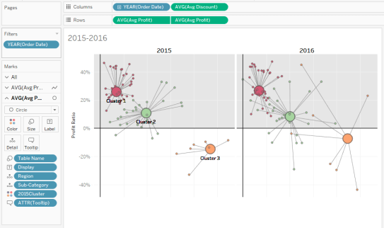
This week on #WorkoutWednesday challenge was set by Luke Stanke and it was about using analytical capability of Tableau specifically clustering. We can perform customer segmentation using clustering algorithm of Tableau but here we will implement clustering algorithm using sub-category and region. In this post, we will go through step by step process of creating clustering and then build Hub & Spoke plots.

Requirements for Workout Wednesday:

  • Dashboard size is 700 x 800; tiled; 2 sheets
  • Create clusters using Profit Ratio (Total Profit/Total Sales) and average discount from only 2015 for sub-category and region. This is the basics of segmentation
  • Show the consistency of each cluster by plotting this over year, as well.
  • Match tooltips.
  • Label the clusters in 2015. Only show the label once. Don’t place many marks of text on top of each other.
  • Match color and formatting. I’ll be paying attention to all parts.
  • JEDI ONLY: Create hub-and-spoke plots that connect the center of each cluster to the value sub-category/region combinations that are part of the 2015 cluster.

Data for the workout can be downloaded from here

Here is my output for the challenge (Click on Image for interactive version):

Step 1: Import the superstore data into Tableau then drag orders sheet multiple times into data area and you should be able to see something like this:

Once data is imported then go to sheet 1

Step 2: As per requirement, we will create clusters using 2015 data on the basis of profit ratio and avg discount. First we will create profit ratio calculated field:

Drag order date from dimensions and filter for the year 2015:

Drag discount field into columns and convert into average then drag profit ratio field into rows. Post this, drag region and sub-category field into details under mark area as shown in below image:

Step 3: From the analytics tab, drag clustering into visualisation area as shown below:

Enter number of clusters as 3

Drag cluster created into data area to create the group and freeze the clusters based on 2015 data and rename the field as 2015Cluster:

you can click on edit the group field and see that 3 groups are created on the basis of 3 clusters:

Step 4: Next step is to create calculated fields to show average profit and average discount on the basis of sub-category, region and cluster:

Step 5: Add new sheet, drag order date to filters and apply filters for year 2015 and 2016. Drag order date (select year) and avg discount field (convert the measure into average) to columns section

Drag avg profit field twice into rows section (convert the measure into average)

Step 6: Change the chart type for first Avg Profit field to line chart then add Region and  sub-category fields into details along with Table Name field into path as shown in below image

Step 7: Change the chart type for second Avg Profit field to circle chart then add Region and sub-category fields into details and drag Table Name field into size as shown in below image then drag 2015cluster field into colors as shown in below image:

Change the graph into dual axis then the data visualisation layer looks like below:

Perform bit of formatting and adding a reference line will make it look like this:

Duplicate the sheet and change filters to 2017 and 2018 then add both the sheet into dashboard. As per requirement change the dashboard size to 700 * 800 and your dashboard is ready with visualisation.

Tableau file can be downloaded from here.

Happy Data Visualisation!!!!

Thanks for visiting this post. Please do let me know your feedback and if any particular topic you would like me to write on.

Do subscribe to Tabvizexplorer.com to keep receive regular updates.