In this post, we will see how to plot candlestick chart in Tableau. We will use the same dataset which we used in previous article on stock analysis – using LOD function.
Here is the final candlestick dashboard for stocks:
Below are the steps to create:
Step 1: Import the stock prices into Tableau which I have in following format.

We will create first 2 calculated fields i.e. closeopendiff and highopendiff formula given below:


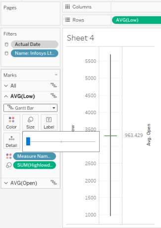
Step 2: Drag Low and Open in the row tab (covert into avg) and make avg(open) into dual axis

Step 3: Edit both the axis and uncheck the include zero checkbox

Step 4: Under tab of Marks, change the automatic to Gann chart for All option. Then under avg(low) in marks tab, drag highlowdiff field into size and make it slim as shown in below image
Step 5: Similarly, drag closeopendiff into avg(open) in marks tab into size and make it thick as shown in below image.

Step 6: Drag actual date from dimension and put into column then right click to change the setting to day as shown below

Step 7: Create one more calculated field to allocate color based on open and close

Step 8: Drag color to avg(open) in marks and put onto color to allocate green for True value and red for False value

Now your candlestick graph is ready to use. you can use date filter to play around with different dates and see the candlestick graphs for different stocks.
Comments and feedback are welcomed!!!
Do subscribe to my blog to keep receiving new posts 🙂